Why Manufacturers Can't See Their Own Margins
Manufacturing finance breaks in a specific way, and it doesn't break loudly.

DASHBOARD DESIGN
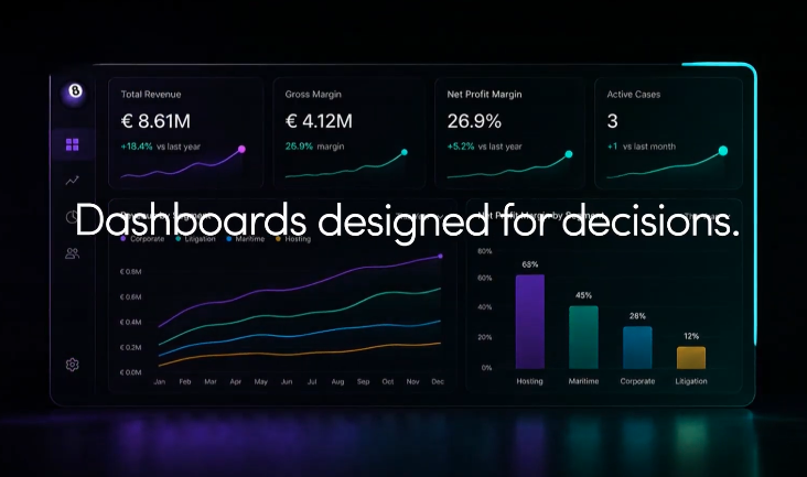
Fewer tiles. Every metric earning its place by changing a decision.
Most reporting layers are designed as if the audience were an analyst. They aren't. The audience is an owner, or a CEO, or a board member. That person doesn't need every KPI the business could theoretically produce. They need the ones that would change a decision this quarter, presented in a way that respects their time.
The design brief for a dashboard is different when you write it for the person deciding rather than the person reporting. The number of tiles goes down. The number of clicks between the top line and the transaction underneath goes down. The number of metrics that are on screen "because we have them" goes to zero. What earns its place on the front page is the small set of numbers that, if any one of them moves outside its band, would change what the leadership team does in the next month.
In hospitality, that usually means the four or five headline numbers that describe the health of the group at a glance, plus a system-status strip that flags which underlying indicators are drifting. Not fifty metrics. The ones that matter. Occupancy and rate matter, but so does receivables ageing, food-cost percentage against target, and the cash forecast for the next sixty days. Everything else lives one click below, ready when the conversation needs it, out of the way when it doesn't.
In manufacturing, the front page usually resolves to product-level margin, WIP position, cash conversion, and the small handful of operating ratios that predict where next quarter's P&L is going. The plant manager and the MD are looking at the same page for different reasons: the plant manager to spot yield drift, the MD to spot the strategic question. That's a design decision, not a filtering feature. It's why the pages don't feel busy even though the business is complicated.
Dashboards built for decisions look calmer than dashboards built for show. There's less on them. The numbers that are on them mean something specific. And every metric has an owner in the leadership team who knows what triggers a conversation.
We build the reporting layer as the visible surface of a foundation that already agrees with itself, which is why it can afford to be calm. Everything on the page is there for a reason. Everything left off the page is off it deliberately. Decisions get made faster because the picture is designed for the decision, not for the audit trail.
If you're carrying a dashboard your leadership team politely tolerates but rarely uses, that's usually a design problem worth half an hour.
A live 30-minute conversation. Nothing to prepare, no figures required. You leave knowing your biggest finance gaps and what to fix first.
Book the CallKEEP READING
Manufacturing finance breaks in a specific way, and it doesn't break loudly.

Privately held hospitality breaks in the same order almost every time, from single-property owner-operators to multi-property groups.

What businesses lose when senior, industry-specific finance support isn't in place: money, time, opportunities, and quietly compounding risk.